Food on Campus
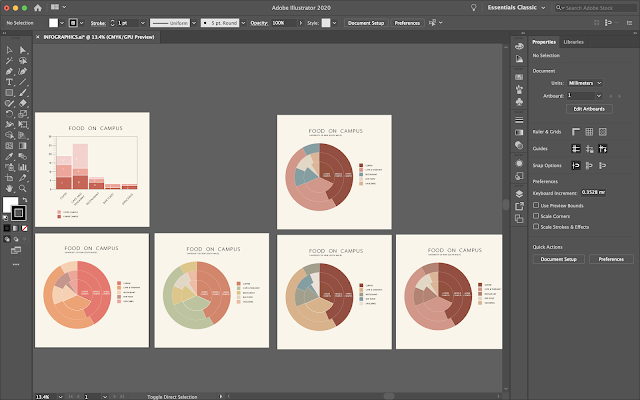
To display the data, I initially chose a bar graph. I modified it to create a multi-layered graph. Luckily, I was able to find some information online about food and retail in UNSW. In the website, you were able to filter your selection with location on campus (lower, middle and upper campus) as well as the cuisine type. I chose the former as there were too many cuisine types.
I altered my method of showing my data set to a pie graph after consulting with my group. Someone (Nicolas) had already chosen a bar graph and we wanted to show a variety of infographics. The following are just the different colour schemes.
We have all decided on using red as a main colour. Warm tones.


No comments:
Post a Comment